Monday, 30 September 2013

Saul Bass.. One of the Greatest Film Poster Designers!

Saul Bass was an American graphic designer whom was undoubtedly a visionary who designed some of the greatest film posters for some of the greatest film-makers: Alfred Hitchcock, Stanley Kubrick, Martin Scorsese amongst many others. One of his most famous quotes, in regards to posters, was simply: "Symbolize and summarize." Bass would often use a minimalist style, along with bold, primary colours, making his posters both ambiguous and vibrant. In this post, I'd like to explore what makes his posters so iconic and eye-catching so that I myself can produce something equally intriguing when it comes to my ancillary task.

Anatomy of a Murder:

Images: This poster features the singular image of disembodied limbs and body parts put together. Such violent, harsh image shocks the viewer and immediately draws them in. As well as relating perfectly to the title of the film, the image has indexical connotations of death and violence, relating to the themes that may perhaps be featured in the film.

Fonts: Bass uses a scratchy, wild font which has metaphorical connotations of mental fragility, thus possibly relating to violence and, consequently, murder.

Language: The title of the film itself itself is very grisly, the word 'murder' suggesting violence and danger. Moreover, the word 'anatomy' has connotations of mystery, investigating and, as a result, discovering.

Colour: The colours red and black are both gruesome, reinforcing the themes of the poster. Both red and black have metaphorical connotations of murder, death and violence. The startling primary colours jump out at the viewer, drawing them in.

Layout: The minimalistic approach means that the imagery and text are very literally at the centre of the poster, suggesting that murder and violence are at the centre of the narrative structure of the poster. The title of the film is written over the top of the body, highlighting to the audience the literal link between imagery and title.

"Anatomy of a Murder" is perhaps my favourite Bass poster, perfectly encapsulating the themes of the poster through it's bold imagery.

The Shining:

Images: Even more minimalistic than Anatomy of a Murder, the poster features a single image of what appears to be a young, shocked boy; he could even be a ghost, as hinted at by the grainy pop-art style with which his face been produced. Therefore, the image has possible connotations of the paranormal, as well as symbolically connoting innocence, shock and fear, all of which are thematically important to the posters narrative.

Fonts: The font for the title is bold and metaphorically loud, adding a sense of epic to the poster. The way the i's haven't been written in capital letters suggest that things are out of place in the film, and that unusual things will happen.

Language: The title is itself ambiguous, making the audience uncertain. The tagline reinforces the epic nature of the poster, claiming that the film is a 'masterpiece', suggesting to the viewer that the film is ground-breaking and innovative.

Colours: Like Anatomy of a Murder, Bass opts for bold colours to draw the audience in. The brightness of the yellow supports the idea of 'The Shining'. The combination of yellow and black comes across as aggressive and has indexical connotations of danger.

Layout: Again, the title is centralised, and the imagery is also synonymous with the title, becoming part of the poster itself. The centralised nature of the title suggests how its supernatural elements are going to be prominent to the posters narrative structure. Moreover, the tagline is what the eye is see's second, re-enforcing the anticipation the poster builds for the audience.

The Shining poster is effective in emphasising the films central paranormal elements, the imagery on the poster truly shocking and gauging with the viewer.

West Side Story:
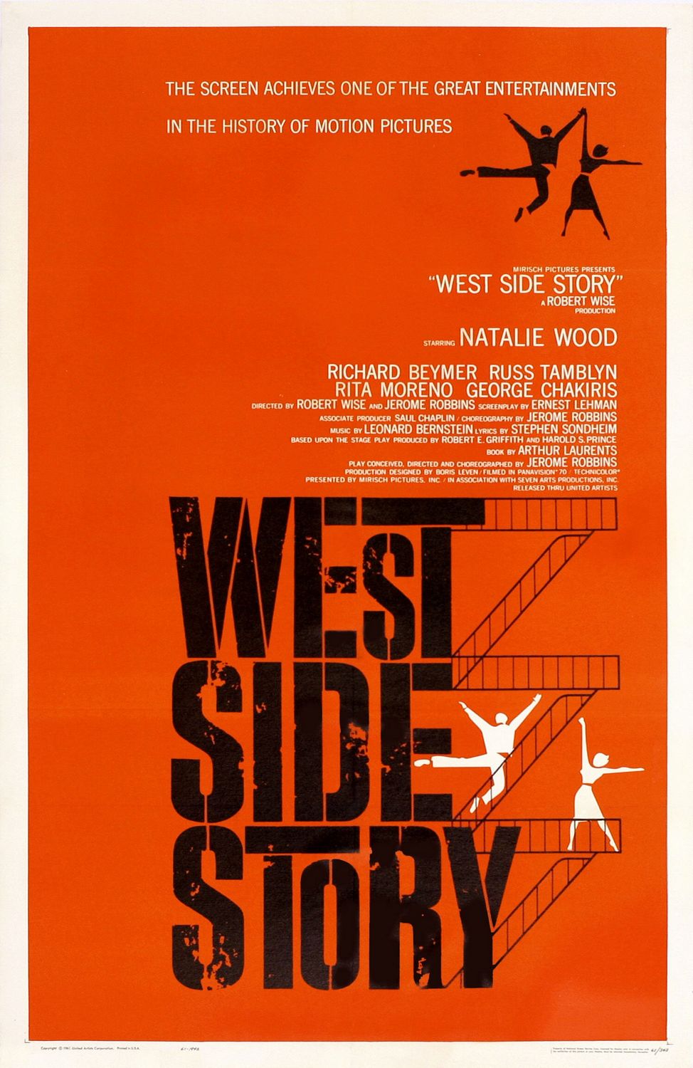
Images: The iconic imagery in this poster is of dancing figures on the fire-exit stairs, which is symbolic of inner-city, thus indexically connoting where the film may take place. There's a real vibrancy to the dancing figures, who feature quite prominently, connoting that this is a film with a feel good factor. Despite this, the figures themselves are still ambiguous, but in essence encapture the main themes of the film.

Fonts: The font for the title is bold, yet also grainy and beaten. This perhaps relates to the title itself, metaphorically connoting the idea that the 'west side' is impoverished and lacks wealth. This idea is related to the imagery of the fire exit stairs, which have connotations of less wealthy areas of New York.

Language: Bass posters have a trend of having suitably epic taglines; this one proclaiming that this film is one of the great achievements in the 'history of motion pictures', heightening the anticipation for the film. The title itself is also ambiguous, but 'story' has connotations of classic storytelling following traditional narrative codes and conventions, most likely including a happy ending.

Colours: Bold, primary colours are again key to this poster. Red is a universal colour that hints at various different themes and emotions; love and passion, hatred and violence. Moreover, black is reflective of the area's lack of wealth. The white of the dancers symbolically connotes purity, thus suggesting that dancing and joy is universal.

Layout: The title in this poster is most prominent, adopting a centralised position within the poster, perhaps suggesting that the film will be made up of an ensemble cast, with no character having more significance. However, the abundance of dancers on the right hand-side make up the narrative structure of the film. The way the stairs go-up the words of the title is also very creative and makes the poster all the more intriguing.

Overall, I've enjoyed looking at the work of Saul Bass. I like the bold, minimalist style of his posters which, ironically, give these epic Hollywood films a rather indie and retro feel. Therefore, I feel like I'd like to adopt some of Bass' creative styles and techniques and incorporate this into my own poster.

An insightful quote from Saul Bass


Analysis of Short Film #2: Forest

Forest is an example of a short film that delivers, despite the fact that not much happens. A poetic piece about nature and the magic of the woods, Forest uses spellbinding cinematography and animation in order to create something that is atmospheric and attention grabbing. Take a look:


The film starts with a wide, panning shot of the forest, in order to engross the audience within the setting. In terms of mise-en-scene, the moonlight casts a really interesting lighting on the forest, reinforcing the idea that the forest has this magical, secretive quality. The slowness of this shot, coupled with a lack of cuts in the opening shots runs parallel with the non-diegetic music, a slow-paced piano which sounds childlike, adding to the magical tone of the piece thus far. Long cuts of the moose and the bird identify the film's central characters; this is supported by the way in which they are centralised within the frame. In terms of camera-work, wide shots and long shots are used frequently to emphasize how alone they are amongst the quiet forest; the editing (or lack of) adds to the quietness of the short. A wide shot of the two protagonists is used to identify how these two animals look at each other as equals. A slow, tilting shot is used as they look up towards the moon, asking the audience too, to 'look up' as well. In terms of muse-en-scene, there's clearly a fantastical element to this short, as demonstrated by the flower on top of the birds head and the leaves on the antlers of the moose, perhaps suggesting the idea that these characters are well and truly a part of nature.

The film then moves into a series of long, wide panning shots of the nature as things begin to happen. The slowness of these shots encourages to engage with the intriguing nature of the animation. The fantastical creatures, coupled with the glowing blue colour palette, adds to the awe-striking nature of the film as a whole. Also, a fade transition is used a t one point in order to add to the slowness of pace, making the audience reflect on the imaginative landscape, having an almost trance-like quality. The camera then zooms into a close-up of the moose's antlers, the pace of the edits quickening temporarily to add to the anticipation of this momentous event within the context of the film. The bird then flies onto the moose's antler, symbolically connoting the togetherness of nature. The climax of the piece is reached as a slow tilt shot moves upwards to look at the moon, casting it's eerie glow on the animals, moving into a fade-out, leaving the audience to reflect as the screen goes to blank.

Many could argue that the films lack of events and ambiguous meaning comes across as pretentious. However, I believe that this a tale told well; its ambitious animation coupled with enchanting non-diegetic and inspired story-boarding make it a fascinating short film. This short in particular has taught me that good short films don't necessarily need to be heavy on characters and plot, and that a more artistic approach can lend itself to an equally brilliant short film...

Sunday, 29 September 2013

Short Film Analysis #1: One Man's Loss

Having looked at various short films, I thought it would be pertinent to share those that I've thought have been executed well, shorts that I admire and have enjoyed myself. First of which is One Man's Loss -directed by Philip Sansom- a fable-like story of fate and the unexpected nature of destiny. Take a look: 


The film begins by intercutting between rich and poor, two men (who appear to be of a similar age) who've gone down totally different paths. This is made clear by mise-en-scene; one wears rags, has no footwear and wears a straggly beard, whilst the other is dressed well and is more conscious of what he looks like, as revealed by the shot in which he looks into the car's rearview mirror. We then move into a shot of the homeless man looking upwards, looking towards a pair of shoes hung on a wire; this acts as a metaphor for our protagonists feelings of desparation, looking upwards at the unattainable, as well as showing the superficial nature of the more wealthy, a theme reinforced later on in the film. The films setting, in a sunswept city most likely to be Los Angeles, creates the ironic idea that this is a place supposed to be full of happiness and vibrancy. Sansom perhaps uses this setting to create a sense of ostracisation for the homeless man, an idea which, again, is reinforced throughout the entirety of the short. 

The man looks up, unaware of the rich mans car, a sequence which has connotations of this idea that hope often makes us blind to our reality. The camera-work in the stand-off between the rich and poor is also significant. The use of a wide shot showing the gap between the pair emphasises their difference. Moreover, shot-reverse-shot also highlights a lack of connection between the unlikely pair. The diegetic words of the rich man ('Idiot!') makes him come accross as impatient and indignant, an idea reinforced by his insistent honking. Comparatively, the homeless mans lack of words emphasise to the audience where the power lies- firmly in the hands of the rich. Our allegiance is very much with the homeless man; in terms of editing, long reaction close-ups of the homeless man are used to make the audience connect with him more. Indeed, the rich mans sunglasses indexically connote a sense of secrecy and seediness- a clever use of foreboding. The anticipation of conflict is further heightened with a quick one-second shot of a woman smoking, which has indexical connotations of stress. Moreover, the colors within her flat are dark, full of shadow, which could be seen as pathetic fallacy, reflective of her darkened mood.

The place then slows down considerably, allowing us to connect further with our protagonist; the rocky, intense music from the rich man's stereo is replaced by non-diegetic piano music, which adds a dour, darkened tone to the piece. Moreover, police sirens and cars in the distance add to the idea that admidst all this action, the protagonist is lonely and isolated. An idea reinforced by long tracking shots of the man on his own, who has to deal with the difficulties of living on the street, such as a shard of glass in his foot, until a shoe falls out of nowhere. I say nowhere because, cleverly, the window and the ensuing argument is off-screen, and so it could be interpreted that this twist in fate is an act of an omniscient God. The flat is directly above the homeless man, connoting a sense of a divide in class. This is idea of class is further emphasised by a panning shot, moving upwards to the wealthy peoples flat.

From the opening shots its clear that our allegiance between the couple are expected to lie with the woman. Her dress is white, symbolic of purity and inncocence. On top of this, she has a foreign accent, which makes her appear more vunerable. Comparatively, the man appears rather provocative, dressed in just a towel, which sub-consciously gives the woman's accusations more depth. The scene in the flat appears raw and emotional, as shown by the handheld camera and the woman's constant movement, making the action feel unscripted and improvised. Moerover, the use of over-the-shoulder shots give us an insight into the emotions of each of the characters. Meanwhile, we see the dark comedy of the woman's actions, as the clothes fall out of the window, straight into the hands of our protagonist. Continual juxtaposition between the argument and the homeless person's bewilderment creates a sense of humour and lightness to the piece.

The scene within the apartment then reaches an emotional climax; the volume of the argument dissipates to a more sinister whisper, making the audience apprehensive. An intense close-up of the man whispering into the woman's ears reveals a demonic expression, revealing the sub-text behind his soft voice. Out of nowhere, the pace between shots is increased and the use of foley sound as she slaps him breaks the scene up, a culmination of their argument for the past few minutes. The pace then halts, revealing a medium shot of the man's look of rage, a glint in his eye that will make his slap all the more aggressive and concerning than hers. Blood appears on her lip, a metaphorical connotation of the destruction of innocence. The camera hangs on the man, who you can tell feel's bad about his actions; however, his lack of trying to win her back emphasises how much of a loser he is.

By this point, both the woman and the homeless man have had transformations in appearance. Her hat and sunglasses age her, making her appear less naive, whilst the homeless man looks dapper in his new outfit. This part has an abundance of dramatic irony; we know that the mans clothes have in actual fact come from the woman's recently-made-ex, which makes the film all the more amusing. The ending emphasises the films ultimate them of fate and following your destiny, the woman driving away from her past, quite literally as the man runs out in chase of her. The film also carries the message that one should be acceptant of fate, however random it is- 'surprise me...' The final image of those shoes hung on the wire emphasise the irony of the entire film: the unobtainable, with the help of fate, is, well... obtainable. The non-diegetic rocky music makes the audience smile, these two characters both having escaped their less-than-reasonable pasts, bound by fate.

I really liked this short film. It carried some great messages and themes, as well as developing some characters that we liked and loathed, which is always special given the films short running length. Also, I loved the cinematography and how sun-drenched LA was captured on film, the city clearly having its own unique colour palette. Therefore, I enjoyed this film and it's given me ideas as to film my own short film.

Thursday, 26 September 2013

Oscar Movie Poster Series #9: Zero Dark Thirty

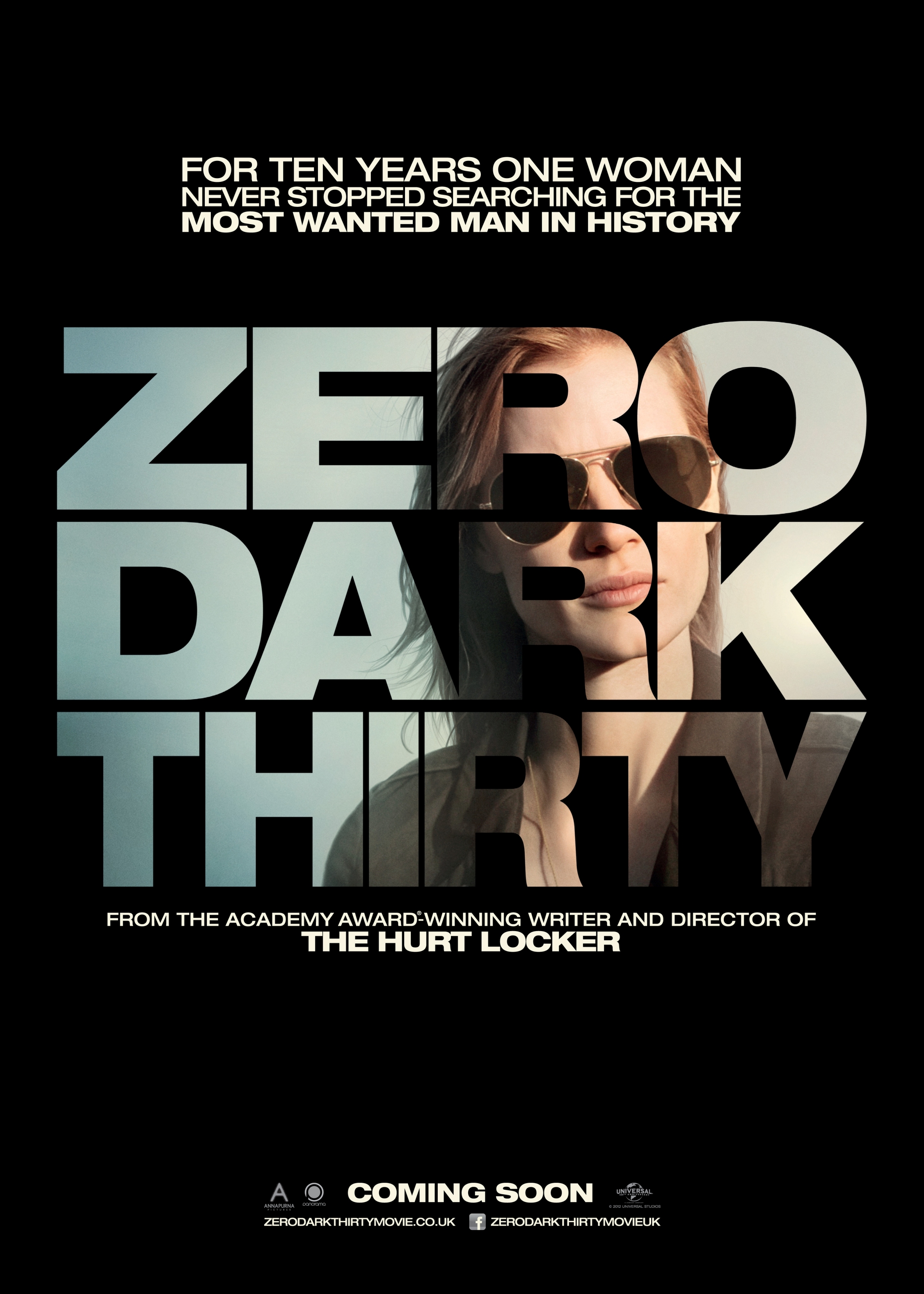
The last in my series of Oscar Movie Posters is Zero Dark Thirty. Jessica Chastain stars in Kathryn Bigelows fascinating account of how, over a ten-year period, the CIA traced down and killed Osama Bin Laden. The poster looks like this...

 
There's not much to the poster for Zero Dark Thirty, but that isn't to say that it's one of the most compelling. To start off with, the primary colors of black and white symbolically connote a conflict between good versus evil which if that interpretation is to be true, is suitably Hollywood. Moreover, black to me has connotations of danger, secrecy and death, all of which make this political thriller all the more fascinating. The tagline is just intriguing; the language is direct and clipped, getting the point accross in a sort and snappy way. It also compel's the viewer because it goes against audience expectation: who would expect this single woman to go after Bin Laden, especially in what is presumably a line of work that is macho and male-dominated. I guess, in that way, the poster caters for a female audience, whilst still being thrilling enough to attract guys. Zero Dark Thirty is, if I remember correctly, a codeword for something military-related; the fact that our protagonist's face is a part of the title metaphorically connotes that she is the mastermind behind the mission. Moreover, in terms of mise-en-scene, her glasses connotes a sense of secrecy and determination. Looking off into the distance, the audience is intrigued as to what it is she's looking at. On top of this, the poster also smartly avoids controversy, choosing to remain sophisticated. The poster avoids mention of Bin Laden himself, skirting anything that may come accross as disrespectful by giving publicity to his name, a name that is, I'm certain, loathed in America. The designer wants to emphasise how the films true theme lies in this women and her attempts for justice. Therefore, I appreciate how this poster has been designed and, in spite of its minimalism, it still retains this writer's interest. 

Oscar Movie Poster Series #8: Life of Pi

Another book-to-movie adaptation next, as Ang Lee brings to life the philosophical adventure of a boy and a tiger in an, um... boat at sea. The vibrant poster is below:
 

There were other posters for this film, but this one, for me, is my favourite. This poster definitely has the most going on, and it's also possibly the most unique, a tiger and its hypnotic eyes at the centre of the poster. In other words, it's epic. The stylised nature of this poster is excellent, and is testament to whomever had the patience to put this poster together; the numerous images are all intiguing. Indeed, I envisage a viewer coul look at this poster for ages, snapshots of this tale, all of which are beautiful, all of which are frustratingly ambiguous. The poster has this hypnotic style; its vibrant colours connote a sense of exoticness and thrilling adventure. The tiger at the centre-piece of the poster is also influential- its piercing eyes look out, capuring the attention of the viewer. The way the tiger is strewn accross snapshots of the film act as a metaphor for the significance of the tiger. The tagline reinforces the epic nature of the poster; 'take the journey' suggests the film is like an experience, not just any old film. The poster is evidently more focused on the intriguing nature of the films narrative; I can tell this due to the omittance of the cast, both in text and in the image itself, but, however, I think the posters unusual nature is still equally effective (if not more so) in getting cinema-goers through the door. In summation, this is one of my favourite posters, playing on the entrancing and mystical nature of the films themes, conveying these ideas in a way thats mysterious and attractive to potential customers.

Oscar Movie Poster Series #7: Argo

Argo, the film that actually one Best Picture, is Ben Afflecks' acclaimed historically-based political thriller. The poster is as follows:
 
 
Argo's poster for me is one of the most intriguing; everything about it is mysterious, and it accurately conveys the film's thriller genre- nothing misleading this time. The tagline is also brilliant- having not seen the film, the tagline doesn't necessarily make sense, but it connotes ideas of deception, violence and an underlying sense of danger. Also in terms of the text, I like how the film is being labelled as a 'declassified true story'. The word 'declassified' insinuates something that is mysterious, hidden from public interest for all these years (the events of the film take place in the 70's)- this makes the film wholly more interesting, making the viewer wonder what it is thats been kept from them. The red streak accross the poster is most certainly eye-catching, indexically connoting violence and bloodshed. The imagery in the middle of the poster, men and women running with panic-stricken faces, further reinforces the idea that danger is going to be present in the film. Also, Ben Affleck's face appears worried; this is connoted through his wide-eyes, looking out the corner of his eye's at some unknown danger, which in turn makes the audience more encaptured with what the film is about. This poster, like many in these series, uses a minimalist approach using, in the main part, Ben Affleck's face to capture the attention of the casual viewer. It's also ambiguous, although there is enough danger to suggest to the audience that this film will be a high-octane, fast paced thrill ride.

Oscar Movie Poster Series #6: Lincoln

Steven Spielberg's bio-pic of Amercan president Abraham Licoln, played by Daniel Day-Lewis, is sixth in my movie poster series. The poster looks like this:
 
 
For a film that centre's around one of America's most notable Presidents. the marketing team at Dreamworks have unsurprisingly opted to have Lincoln himself at the heart of the poster. Note the angle of the picture obscures much of Day-Lewis' face. One reason for this was that there was a lot of anticipation surrounding Day-Lewis and how he'd look like in the role. Alternatively, the obscured nature of the photo could connote this idea of how little we knew of Lincoln's life behind closed doors, thus suggesting that the film will uncover the secrets of his life. The image itself conveys a dour looking Lincoln; this is conveyed through his body language (looking downwards with a straight face), and the colouring of the image, which is in black and white. Looking downwards symbolically connotes the idea of reflection, looking back on his life. As well as this, it could be inferred that the dark nature of the picture acts as a metaphor for his life, surrounded in hardships. The poster lacks a tagline, perhaps to its detriment, but actually I think the minimalist approach of the poster is a positive thing, and could perhaps become tacky with an added tagline, along with a list of the cast. Therefore, I'm a fan of this simplistic style of poster and I think its ambiguous nature teases the audience effectively...