Monday 30 September 2013

Saul Bass.. One of the Greatest Film Poster Designers!

Saul Bass was an American graphic designer whom was undoubtedly a visionary who designed some of the greatest film posters for some of the greatest film-makers: Alfred Hitchcock, Stanley Kubrick, Martin Scorsese amongst many others. One of his most famous quotes, in regards to posters, was simply: "Symbolize and summarize." Bass would often use a minimalist style, along with bold, primary colours, making his posters both ambiguous and vibrant. In this post, I'd like to explore what makes his posters so iconic and eye-catching so that I myself can produce something equally intriguing when it comes to my ancillary task.

Anatomy of a Murder:

Images: This poster features the singular image of disembodied limbs and body parts put together. Such violent, harsh image shocks the viewer and immediately draws them in. As well as relating perfectly to the title of the film, the image has indexical connotations of death and violence, relating to the themes that may perhaps be featured in the film.

Fonts: Bass uses a scratchy, wild font which has metaphorical connotations of mental fragility, thus possibly relating to violence and, consequently, murder.

Language: The title of the film itself itself is very grisly, the word 'murder' suggesting violence and danger. Moreover, the word 'anatomy' has connotations of mystery, investigating and, as a result, discovering.

Colour: The colours red and black are both gruesome, reinforcing the themes of the poster. Both red and black have metaphorical connotations of murder, death and violence. The startling primary colours jump out at the viewer, drawing them in.

Layout: The minimalistic approach means that the imagery and text are very literally at the centre of the poster, suggesting that murder and violence are at the centre of the narrative structure of the poster. The title of the film is written over the top of the body, highlighting to the audience the literal link between imagery and title.

"Anatomy of a Murder" is perhaps my favourite Bass poster, perfectly encapsulating the themes of the poster through it's bold imagery.

The Shining:

Images: Even more minimalistic than Anatomy of a Murder, the poster features a single image of what appears to be a young, shocked boy; he could even be a ghost, as hinted at by the grainy pop-art style with which his face been produced. Therefore, the image has possible connotations of the paranormal, as well as symbolically connoting innocence, shock and fear, all of which are thematically important to the posters narrative.

Fonts: The font for the title is bold and metaphorically loud, adding a sense of epic to the poster. The way the i's haven't been written in capital letters suggest that things are out of place in the film, and that unusual things will happen.

Language: The title is itself ambiguous, making the audience uncertain. The tagline reinforces the epic nature of the poster, claiming that the film is a 'masterpiece', suggesting to the viewer that the film is ground-breaking and innovative.

Colours: Like Anatomy of a Murder, Bass opts for bold colours to draw the audience in. The brightness of the yellow supports the idea of 'The Shining'. The combination of yellow and black comes across as aggressive and has indexical connotations of danger.

Layout: Again, the title is centralised, and the imagery is also synonymous with the title, becoming part of the poster itself. The centralised nature of the title suggests how its supernatural elements are going to be prominent to the posters narrative structure. Moreover, the tagline is what the eye is see's second, re-enforcing the anticipation the poster builds for the audience.

The Shining poster is effective in emphasising the films central paranormal elements, the imagery on the poster truly shocking and gauging with the viewer.

West Side Story:

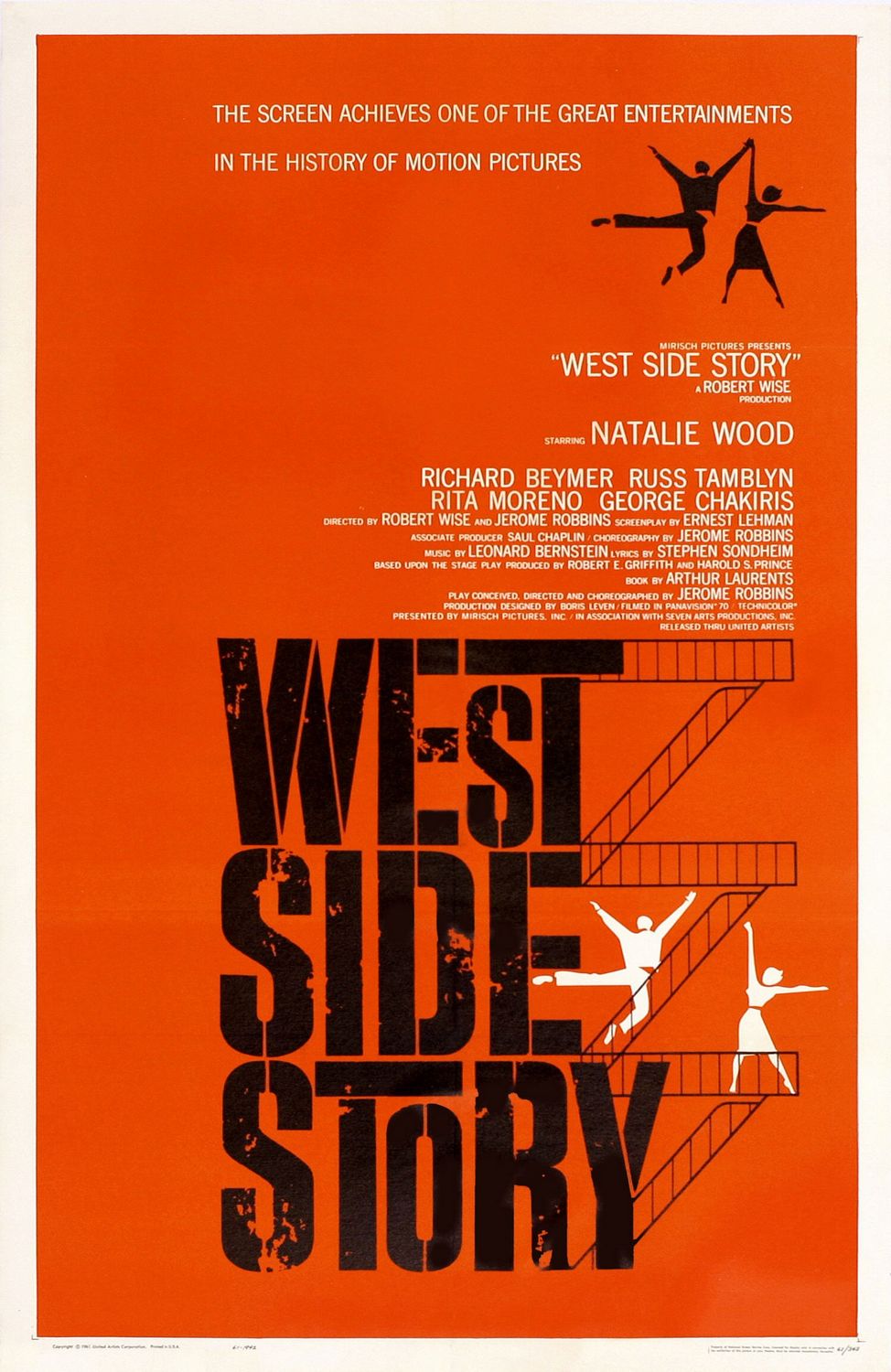
Images: The iconic imagery in this poster is of dancing figures on the fire-exit stairs, which is symbolic of inner-city, thus indexically connoting where the film may take place. There's a real vibrancy to the dancing figures, who feature quite prominently, connoting that this is a film with a feel good factor. Despite this, the figures themselves are still ambiguous, but in essence encapture the main themes of the film.

Fonts: The font for the title is bold, yet also grainy and beaten. This perhaps relates to the title itself, metaphorically connoting the idea that the 'west side' is impoverished and lacks wealth. This idea is related to the imagery of the fire exit stairs, which have connotations of less wealthy areas of New York.

Language: Bass posters have a trend of having suitably epic taglines; this one proclaiming that this film is one of the great achievements in the 'history of motion pictures', heightening the anticipation for the film. The title itself is also ambiguous, but 'story' has connotations of classic storytelling following traditional narrative codes and conventions, most likely including a happy ending.

Colours: Bold, primary colours are again key to this poster. Red is a universal colour that hints at various different themes and emotions; love and passion, hatred and violence. Moreover, black is reflective of the area's lack of wealth. The white of the dancers symbolically connotes purity, thus suggesting that dancing and joy is universal.

Layout: The title in this poster is most prominent, adopting a centralised position within the poster, perhaps suggesting that the film will be made up of an ensemble cast, with no character having more significance. However, the abundance of dancers on the right hand-side make up the narrative structure of the film. The way the stairs go-up the words of the title is also very creative and makes the poster all the more intriguing.

Overall, I've enjoyed looking at the work of Saul Bass. I like the bold, minimalist style of his posters which, ironically, give these epic Hollywood films a rather indie and retro feel. Therefore, I feel like I'd like to adopt some of Bass' creative styles and techniques and incorporate this into my own poster.

An insightful quote from Saul Bass


Analysis of Short Film #2: Forest

Forest is an example of a short film that delivers, despite the fact that not much happens. A poetic piece about nature and the magic of the woods, Forest uses spellbinding cinematography and animation in order to create something that is atmospheric and attention grabbing. Take a look:


The film starts with a wide, panning shot of the forest, in order to engross the audience within the setting. In terms of mise-en-scene, the moonlight casts a really interesting lighting on the forest, reinforcing the idea that the forest has this magical, secretive quality. The slowness of this shot, coupled with a lack of cuts in the opening shots runs parallel with the non-diegetic music, a slow-paced piano which sounds childlike, adding to the magical tone of the piece thus far. Long cuts of the moose and the bird identify the film's central characters; this is supported by the way in which they are centralised within the frame. In terms of camera-work, wide shots and long shots are used frequently to emphasize how alone they are amongst the quiet forest; the editing (or lack of) adds to the quietness of the short. A wide shot of the two protagonists is used to identify how these two animals look at each other as equals. A slow, tilting shot is used as they look up towards the moon, asking the audience too, to 'look up' as well. In terms of muse-en-scene, there's clearly a fantastical element to this short, as demonstrated by the flower on top of the birds head and the leaves on the antlers of the moose, perhaps suggesting the idea that these characters are well and truly a part of nature.

The film then moves into a series of long, wide panning shots of the nature as things begin to happen. The slowness of these shots encourages to engage with the intriguing nature of the animation. The fantastical creatures, coupled with the glowing blue colour palette, adds to the awe-striking nature of the film as a whole. Also, a fade transition is used a t one point in order to add to the slowness of pace, making the audience reflect on the imaginative landscape, having an almost trance-like quality. The camera then zooms into a close-up of the moose's antlers, the pace of the edits quickening temporarily to add to the anticipation of this momentous event within the context of the film. The bird then flies onto the moose's antler, symbolically connoting the togetherness of nature. The climax of the piece is reached as a slow tilt shot moves upwards to look at the moon, casting it's eerie glow on the animals, moving into a fade-out, leaving the audience to reflect as the screen goes to blank.

Many could argue that the films lack of events and ambiguous meaning comes across as pretentious. However, I believe that this a tale told well; its ambitious animation coupled with enchanting non-diegetic and inspired story-boarding make it a fascinating short film. This short in particular has taught me that good short films don't necessarily need to be heavy on characters and plot, and that a more artistic approach can lend itself to an equally brilliant short film...

Sunday 29 September 2013

Short Film Analysis #1: One Man's Loss

Having looked at various short films, I thought it would be pertinent to share those that I've thought have been executed well, shorts that I admire and have enjoyed myself. First of which is One Man's Loss -directed by Philip Sansom- a fable-like story of fate and the unexpected nature of destiny. Take a look: 


The film begins by intercutting between rich and poor, two men (who appear to be of a similar age) who've gone down totally different paths. This is made clear by mise-en-scene; one wears rags, has no footwear and wears a straggly beard, whilst the other is dressed well and is more conscious of what he looks like, as revealed by the shot in which he looks into the car's rearview mirror. We then move into a shot of the homeless man looking upwards, looking towards a pair of shoes hung on a wire; this acts as a metaphor for our protagonists feelings of desparation, looking upwards at the unattainable, as well as showing the superficial nature of the more wealthy, a theme reinforced later on in the film. The films setting, in a sunswept city most likely to be Los Angeles, creates the ironic idea that this is a place supposed to be full of happiness and vibrancy. Sansom perhaps uses this setting to create a sense of ostracisation for the homeless man, an idea which, again, is reinforced throughout the entirety of the short. 

The man looks up, unaware of the rich mans car, a sequence which has connotations of this idea that hope often makes us blind to our reality. The camera-work in the stand-off between the rich and poor is also significant. The use of a wide shot showing the gap between the pair emphasises their difference. Moreover, shot-reverse-shot also highlights a lack of connection between the unlikely pair. The diegetic words of the rich man ('Idiot!') makes him come accross as impatient and indignant, an idea reinforced by his insistent honking. Comparatively, the homeless mans lack of words emphasise to the audience where the power lies- firmly in the hands of the rich. Our allegiance is very much with the homeless man; in terms of editing, long reaction close-ups of the homeless man are used to make the audience connect with him more. Indeed, the rich mans sunglasses indexically connote a sense of secrecy and seediness- a clever use of foreboding. The anticipation of conflict is further heightened with a quick one-second shot of a woman smoking, which has indexical connotations of stress. Moreover, the colors within her flat are dark, full of shadow, which could be seen as pathetic fallacy, reflective of her darkened mood.

The place then slows down considerably, allowing us to connect further with our protagonist; the rocky, intense music from the rich man's stereo is replaced by non-diegetic piano music, which adds a dour, darkened tone to the piece. Moreover, police sirens and cars in the distance add to the idea that admidst all this action, the protagonist is lonely and isolated. An idea reinforced by long tracking shots of the man on his own, who has to deal with the difficulties of living on the street, such as a shard of glass in his foot, until a shoe falls out of nowhere. I say nowhere because, cleverly, the window and the ensuing argument is off-screen, and so it could be interpreted that this twist in fate is an act of an omniscient God. The flat is directly above the homeless man, connoting a sense of a divide in class. This is idea of class is further emphasised by a panning shot, moving upwards to the wealthy peoples flat.

From the opening shots its clear that our allegiance between the couple are expected to lie with the woman. Her dress is white, symbolic of purity and inncocence. On top of this, she has a foreign accent, which makes her appear more vunerable. Comparatively, the man appears rather provocative, dressed in just a towel, which sub-consciously gives the woman's accusations more depth. The scene in the flat appears raw and emotional, as shown by the handheld camera and the woman's constant movement, making the action feel unscripted and improvised. Moerover, the use of over-the-shoulder shots give us an insight into the emotions of each of the characters. Meanwhile, we see the dark comedy of the woman's actions, as the clothes fall out of the window, straight into the hands of our protagonist. Continual juxtaposition between the argument and the homeless person's bewilderment creates a sense of humour and lightness to the piece.

The scene within the apartment then reaches an emotional climax; the volume of the argument dissipates to a more sinister whisper, making the audience apprehensive. An intense close-up of the man whispering into the woman's ears reveals a demonic expression, revealing the sub-text behind his soft voice. Out of nowhere, the pace between shots is increased and the use of foley sound as she slaps him breaks the scene up, a culmination of their argument for the past few minutes. The pace then halts, revealing a medium shot of the man's look of rage, a glint in his eye that will make his slap all the more aggressive and concerning than hers. Blood appears on her lip, a metaphorical connotation of the destruction of innocence. The camera hangs on the man, who you can tell feel's bad about his actions; however, his lack of trying to win her back emphasises how much of a loser he is.

By this point, both the woman and the homeless man have had transformations in appearance. Her hat and sunglasses age her, making her appear less naive, whilst the homeless man looks dapper in his new outfit. This part has an abundance of dramatic irony; we know that the mans clothes have in actual fact come from the woman's recently-made-ex, which makes the film all the more amusing. The ending emphasises the films ultimate them of fate and following your destiny, the woman driving away from her past, quite literally as the man runs out in chase of her. The film also carries the message that one should be acceptant of fate, however random it is- 'surprise me...' The final image of those shoes hung on the wire emphasise the irony of the entire film: the unobtainable, with the help of fate, is, well... obtainable. The non-diegetic rocky music makes the audience smile, these two characters both having escaped their less-than-reasonable pasts, bound by fate.

I really liked this short film. It carried some great messages and themes, as well as developing some characters that we liked and loathed, which is always special given the films short running length. Also, I loved the cinematography and how sun-drenched LA was captured on film, the city clearly having its own unique colour palette. Therefore, I enjoyed this film and it's given me ideas as to film my own short film.

Thursday 26 September 2013

Oscar Movie Poster Series #9: Zero Dark Thirty

The last in my series of Oscar Movie Posters is Zero Dark Thirty. Jessica Chastain stars in Kathryn Bigelows fascinating account of how, over a ten-year period, the CIA traced down and killed Osama Bin Laden. The poster looks like this...

 
There's not much to the poster for Zero Dark Thirty, but that isn't to say that it's one of the most compelling. To start off with, the primary colors of black and white symbolically connote a conflict between good versus evil which if that interpretation is to be true, is suitably Hollywood. Moreover, black to me has connotations of danger, secrecy and death, all of which make this political thriller all the more fascinating. The tagline is just intriguing; the language is direct and clipped, getting the point accross in a sort and snappy way. It also compel's the viewer because it goes against audience expectation: who would expect this single woman to go after Bin Laden, especially in what is presumably a line of work that is macho and male-dominated. I guess, in that way, the poster caters for a female audience, whilst still being thrilling enough to attract guys. Zero Dark Thirty is, if I remember correctly, a codeword for something military-related; the fact that our protagonist's face is a part of the title metaphorically connotes that she is the mastermind behind the mission. Moreover, in terms of mise-en-scene, her glasses connotes a sense of secrecy and determination. Looking off into the distance, the audience is intrigued as to what it is she's looking at. On top of this, the poster also smartly avoids controversy, choosing to remain sophisticated. The poster avoids mention of Bin Laden himself, skirting anything that may come accross as disrespectful by giving publicity to his name, a name that is, I'm certain, loathed in America. The designer wants to emphasise how the films true theme lies in this women and her attempts for justice. Therefore, I appreciate how this poster has been designed and, in spite of its minimalism, it still retains this writer's interest. 

Oscar Movie Poster Series #8: Life of Pi

Another book-to-movie adaptation next, as Ang Lee brings to life the philosophical adventure of a boy and a tiger in an, um... boat at sea. The vibrant poster is below:
 

There were other posters for this film, but this one, for me, is my favourite. This poster definitely has the most going on, and it's also possibly the most unique, a tiger and its hypnotic eyes at the centre of the poster. In other words, it's epic. The stylised nature of this poster is excellent, and is testament to whomever had the patience to put this poster together; the numerous images are all intiguing. Indeed, I envisage a viewer coul look at this poster for ages, snapshots of this tale, all of which are beautiful, all of which are frustratingly ambiguous. The poster has this hypnotic style; its vibrant colours connote a sense of exoticness and thrilling adventure. The tiger at the centre-piece of the poster is also influential- its piercing eyes look out, capuring the attention of the viewer. The way the tiger is strewn accross snapshots of the film act as a metaphor for the significance of the tiger. The tagline reinforces the epic nature of the poster; 'take the journey' suggests the film is like an experience, not just any old film. The poster is evidently more focused on the intriguing nature of the films narrative; I can tell this due to the omittance of the cast, both in text and in the image itself, but, however, I think the posters unusual nature is still equally effective (if not more so) in getting cinema-goers through the door. In summation, this is one of my favourite posters, playing on the entrancing and mystical nature of the films themes, conveying these ideas in a way thats mysterious and attractive to potential customers.

Oscar Movie Poster Series #7: Argo

Argo, the film that actually one Best Picture, is Ben Afflecks' acclaimed historically-based political thriller. The poster is as follows:
 
 
Argo's poster for me is one of the most intriguing; everything about it is mysterious, and it accurately conveys the film's thriller genre- nothing misleading this time. The tagline is also brilliant- having not seen the film, the tagline doesn't necessarily make sense, but it connotes ideas of deception, violence and an underlying sense of danger. Also in terms of the text, I like how the film is being labelled as a 'declassified true story'. The word 'declassified' insinuates something that is mysterious, hidden from public interest for all these years (the events of the film take place in the 70's)- this makes the film wholly more interesting, making the viewer wonder what it is thats been kept from them. The red streak accross the poster is most certainly eye-catching, indexically connoting violence and bloodshed. The imagery in the middle of the poster, men and women running with panic-stricken faces, further reinforces the idea that danger is going to be present in the film. Also, Ben Affleck's face appears worried; this is connoted through his wide-eyes, looking out the corner of his eye's at some unknown danger, which in turn makes the audience more encaptured with what the film is about. This poster, like many in these series, uses a minimalist approach using, in the main part, Ben Affleck's face to capture the attention of the casual viewer. It's also ambiguous, although there is enough danger to suggest to the audience that this film will be a high-octane, fast paced thrill ride.

Oscar Movie Poster Series #6: Lincoln

Steven Spielberg's bio-pic of Amercan president Abraham Licoln, played by Daniel Day-Lewis, is sixth in my movie poster series. The poster looks like this:
 
 
For a film that centre's around one of America's most notable Presidents. the marketing team at Dreamworks have unsurprisingly opted to have Lincoln himself at the heart of the poster. Note the angle of the picture obscures much of Day-Lewis' face. One reason for this was that there was a lot of anticipation surrounding Day-Lewis and how he'd look like in the role. Alternatively, the obscured nature of the photo could connote this idea of how little we knew of Lincoln's life behind closed doors, thus suggesting that the film will uncover the secrets of his life. The image itself conveys a dour looking Lincoln; this is conveyed through his body language (looking downwards with a straight face), and the colouring of the image, which is in black and white. Looking downwards symbolically connotes the idea of reflection, looking back on his life. As well as this, it could be inferred that the dark nature of the picture acts as a metaphor for his life, surrounded in hardships. The poster lacks a tagline, perhaps to its detriment, but actually I think the minimalist approach of the poster is a positive thing, and could perhaps become tacky with an added tagline, along with a list of the cast. Therefore, I'm a fan of this simplistic style of poster and I think its ambiguous nature teases the audience effectively...


Wednesday 25 September 2013

Oscar Movie Poster Series #5: Silver Linings Playbook

Fifth is David O'Russell's drama/rom-com Silver Linings Playbook led by Jennifer Lawrence and Bradley Cooper:


This is my least favored of the ten posters, which is a shame, because it's not the worst film. The book was great, the film good, but the poster leaves much to be desired. Why's this? Well, the film is really about depression, and how love can save us from demise. It's also about American football- indeed, the title alludes to this. However, I'm disappointed in how the Weinsteins' shy away from these key themes because they're difficult to cater for to an international audience, especially when football isn't such a global sport. When marketing, you can't mislead your audience, to the extent where the poster conveys a flashy rom-com about two flawless Hollywood stars- that's not what the film is and shows a lack of confidence in your target market. Asides from this, I dislike how the excellent ensemble cast is, for the most part, omitted from the poster. Also, the color scheme comes across as too demure. However, I do appreciate the playbook-like graphics, which acts as a teaser for the films themes, and the openness of the pairing in the poster creates a bond and connection with the audience.

Oscar Movie Poster Series #4: Les Miserables

Les Miserables, the classic French-revolution-set musical, featuring Hugh Jackman and Anne Hathaway, makes up part four in my movie poster series:

Les Miserables is an interesting one: how does one market a film that is set on a play that, unless you've lived under a rock, you will of course know about? The simple answer, perhaps is to bring to life the iconic art that will no doubt be emblazoned upon a West End theatre near you. You know, this one, of one of the plays ensemble characters, Cossette:


Although this may seem like one of Universal's most uninspired marketing moves, it's actually really clever. The iconic imagery connects us with nostalgic memories of the musical, paying homage to its predecessor without coming accross as though it wants to distance itself too much. Similar to Django, Les Mis is in the fortunate position where it can rely on star power, as seen in the top of the poster. However, the poster is reliant on the face of this young girl; her large eyes hint at naivety and innocence, whilst her windswept and hair and smudged face perhaps connote a corruption of innocence. The tagline is suitably epic, drawing on the film's themes with a hyperbolic full stop at the end of each word. Moreover, the word 'phenomenon' creates a sense of anticipation- it seems to be human nature to want to be a part of the phenomenon, creating buzz around the film. Whilst the poster omits Academy-award-winning director Tom Hooper's involvement with the film, this is perhaps a show of confidence, that the play and its inbuilt fanbase will want to see the film anyway, regardless of whom directed it.

Oscar Movie Poster Series #3: Amour

Part three of this series continues with Michael Haneke's acclaimed foreign language film, Amour, centering around the relationship of an elderly couple:


Amour is perhaps the most compelling of all ten films, given that it's the least I know about; the poster appears to be one of the most metaphorically-laden of each of the posters which, for this writer at least, gives me plenty to look at. Ironically, it's quite obvious that this is the non-American film within the list. I can tell this by the glum color palette (grey and blacks), as well as a focus on an elderly woman, both of which go against the archetypal cynical-Hollywood attitude. Indeed, both of these factors make this poster one of those I look upon in high regard: it isn't supposed to jump out at you, which in turn  makes it jump out at you. The eyes also catch your attention: whom is she looking at? What is she thinking behind those eyes? The cupping of her ears is also significant- I can only hazard a guess as to what this connotes: Denial? Naivety? Love? It's a question the audience doesn't know the answer to, which, of course, makes us want to buy a ticket and find out. 

Oscar Movie Poster Series #2: Django Unchained

Next in the series is revered filmmaker Quentin Tarantino's Django Unchained, a western that followed a vengeful slave-turned- bounty hunter, played by Jamie Foxx:


Tarantino (somewhat unsurprisingly) attracts a heavyweight cast for each of his films; therefore, it's unsurprising that each star's name is at the core of this intriguing poster. Like Beasts in my previous post, Django Unchained is also ambiguous in it's narrative structure, playing on the big names- including Tarantino's himself- to attract a large audience. The three characters stare out of the poster, drawing 'eye contact' with the viewer, asking the viewer to question of the motives of each of the three men. The bold color palette, including red, connotes a sense of conflict and bloodshed. Additionally, the guns on the poster symbolically connote danger and violence which, of course, are a big part of Tarantino's movies. The tagline introduces key themes of vengeance, without giving away any core plot details, and the title itself ('unchained') suggests to me the idea of a rabid animal being let loose. This poster is indeed effective, making the audience want to find out more about Tarantino's compelling Westerner...

Oscars Movie Poster Series #1: Beasts of the Southern Wild

As part of my ancillary task, I have to design a movie poster to accompany my short film. Whilst I'm still deciding on a specific genre of my film, I thought it would be pertinent to look at previously existing media texts in order to gauge the codes and conventions of film posters', understanding what makes a poster successful. Therefore, where better to look at than the posters for all nine nominated best picture films at this years academy awards, all of which had posters and high marketing budgets that attracted audiences around the globe to watch. To begin the series is Sundance hit, Beasts of the Southern Wild:


This poster will undoubtedly end up being one of my favorite's in this series. The poster is subtly ambiguous, making the viewer ask 'Who is this figure? What is she running to/from?' When a viewer is asking these questions, then it's safe to assume that you've drawn the viewer in, wanting to find  out more. I like the bold color palette, a mixture of dramatic colors that gives the poster an emotional depth. The streamers connote joy and happiness, giving the viewer a sense of feel-good, that the film will put them in a good mood- sounds simplistic, but it's important when enticing a market. At the centerpiece of the image is the girl, shrouded in darkness, a silhouette; again, this reinforces the idea of mystery and uncertainty. The title doesn't seem to have any correlation to image itself, which again creates a sense of mystery, drawing the soon-to-be customer in. Also, the use of positive quotes from respected publications such as the New York Times creates a sense of hype around a film, making the viewer respect the film a bit more- especially given the low-budget this particular film had. Overall, I love this poster; the mystery, the uplifting image and the ambiguity, coupled with the high praise making me want to watch this movie... 

Where I'm At.

Currently, I'd like to boost my number of posts, posting more regularly whilst maintaining the quality of my posts. Additionally, I'd like to give my survey more exposure as, at the moment, my tally of four responses clearly isn't good enough in order to gauge an accurate set of results. Moreover, I need to complete several analysis' of short films in order to understand codes and conventions of several different short film genres. At the moment, this is what I need to focus on...

A Short History of Short Films!

As part of my research, I've decided to explore how short films came about, and how this sub-genre has evolved in the past hundred years. Gaining some contextual knowledge of short films will allow me to understand how tastes and preferences have changed in terms of genre, as well as finding out how short films are distributed and marketed. The following is, in my own words, a short history of short films...

In the late 19th Century, as film came to the fore, all film was short. The kinetoscope, designed for the individual as opposed to the masses, was a novelty whereby the viewer could witness seconds-long films of "interest": as The Telegraph writes, this would typically include "royal processions, travelogues... current affairs." The most famous of these was the Lumiere brothers' "Arrival of a Train at La Ciotat" (1895). The film was revolutionary, considered to be the first motion picture in history, a speeding train racing towards the audience supposedly terrifying audiences on a scale no ordinary horror movie could achieve today. Short film was beginning to attract audiences on an unprecedented scale; click below to watch Arrival of a Train at La Ciotat:


As the 1900's dawned, technological advancements meant that short films began to be longer. Consequently, short films gradually began to fall out of favour and, from 1910 onwards, multi-reel, feature length films gained more popularity. Examples of the first ever feature films include Tucker's controversial "Traffic in Souls (1913)". Whilst short, single-reel films were seen as fanciful and novel, a feature films length, coupled with its narrative complexity, allowed feature films to be seen in a respected light, alongside theatre and opera. Films attracted wealth audiences, meaning that over the next three decades purpose-built cinemas (known as picture palaces) were erected. With star names and elaborate budgets, short films on their own didn't attract mainstream popularity.

However, short films and news reels often preceded the feature programme. Indeed, short films were important during Word War Two to provide a means of propaganda. Such propaganda, which conveyed British serviceman fighting heroically attracted a lot of popularity, although many thought that short films would begin to give cinema a bad name, an interference when the cinema was primarily for the American-made feature films. The factual nature of shorts led to their demise and, whilst they were still shown preceding the main feature, they were simply an excuse to visit the toilet or to get refreshments. In present-day terms, short films were just a very dull, and slightly irritable infomercial. Financially-motivated changes within the industry, with adverts becoming more prominent, short film was a dying art (with the exception of kid's cartoons, which were played in cinema's up to the Eighties.
MTV Logo

As short film fell out of favour with mainstream audiences, this form of film-making was taken up as a rebellious, guerilla-style form of art (a reputation that- to some extent- remains to this day). Pop- culture visionaries such as Andy Warhol would use short film as a form of conceptual art. Alternatively, short-film makers began to make music videos, as MTV became to gain notoriety.
Kony 2012

It was really in the mid-nineties when shorts began their ascent back to former glory, as digital technology became more affordable, and more widespread on an international scale. Then, as the 21st Century came along, YouTube, and other social media sites were created, and totally changed short films' popularity. The bite-sized chunk of shorts meant that short films were perfect for sites like YouTube. The website brought the world together: one second you could be watching an animation from Peru, the next minute you could be watching a documentary from Australia. Moreover, Facebook and Twitter could allow your video to go viral, shared and watched by millions. From the sublime (Kony 2012), to the ridiculous (the Harlem Shake), short films have the potential to reach unprecedented audiences. Short films have had mixed success, but nowadays are firmly one of the most popular forms of media as the world becomes more media saturated.

My Survey

Below is my short film survey; from this I hope to understand people's preferences which should, hopefully, help to produce a better product. Feel free to add a response- thank-you in advance!

Survey Time.

As part of my research, I feel that it's essential to create an initial questionnaire in order to gauge an idea of what people expect from a short film and what the general public feel's will make for the best short film I can make. It's important to note that I aim to complete up to three more surveys as I further my research; consequently, I'll be able to use these responses effectively to further the 'planning' stage of my task. Also, I plan to have over 100 responses to each of my surveys; this number (coupled with a range of ages and tastes) will give me a set of responses that give an accurate set of answers, making my surveys more effective. Watch this space for my survey...

Deciding on a Production Brief!

Having thought carefully about each of the three briefs, I've come to the conclusion that the best choice for me would be the short film. Whilst there are pro's and con's to each, ultimately, the one that would allow me the most creative licence is the short film. I've endeavored to explore the positive and negative aspects that come with each brief, and why, consequently, I've found the short film task to be most appropriate for me:

Music video:

 Positives:

  • Unlike the short film, the music video doesn't necessarily need much of a plot in the same way that the short film would need. Therefore, the music video allows for a much more thematic form of storytelling as opposed to anything specific, which makes the planning process much easier.
  • There's an endless amount of shots that a music video could feature. As story-telling isn't at the forefront of a music video, this allows for more creative selection of shots.
Negatives:

  • Including the music within the video perhaps makes it difficult to get a theme or message across effectively, without the use of sound for protagonists for the majority of the video.
  • However, perhaps most importantly, is the fact that copyrighted music can't be used. The selection of copyright-free music is (in my opinion) poor, and I don't feel passionately about the music that we're able to use.

Advertisement for a product or service:


Positives:


  • The short length of an advertisement would make me more focused on the standard of the shots.
  • The ancillary task for the advertisement brief is interesting and, moreover, in all honesty this is the brief each of us are most knowledgeable about given the power of advertising that reaches us on a daily basis.
Negatives:

  • On the other hand, the short length of advertisements means that there isn't much room for mistakes. Comparatively, both the music video and short film briefs are able to act as more of a showcase of all my skills and abilities.
  • Personally speaking, my interests don't really lie in marketing or selling products. Therefore, this brief is not the appropriate choice for me.

Short film (of up to 5mins length):


Positives:


  • This is undoubtedly the one brief that is most unbound from the codes and conventions of its predecessors; in other words, the short film brief is the most imaginative and open to creativity.
  • A short film can include a variety of shots and film-making skills within its five minutes length.
  • The ancillary tasks appeal to me- my interest in photograph as well as an interest in reading  magazine reviews means that the production of a review and a poster look most interesting.
Negatives:

  • It's important to come up with a plot that can sustain a short film's length; therefore, I must be careful when storyboarding and planning my final product!

Overall, I feel pleased to select the short film production task; my interest in film-making means that this task is most appropriate to my personality and interests. Subsequently, I'm pleased to now get on with research and planning for my own short film...

Production Brief (3/3): Short Film

Our final brief is a short film, which should be up to five minutes long. I believe that creating a short film is perhaps the most creative of the production briefs, given the diverse range of genres a short film could be about, from Documentaries to Dramas. As a result of this, I feel as though there wouldn't be such a need to conform to codes and conventions. Short films are also innovative; the sub-genre is going from strength to strength and is becoming increasingly popular as social media such as Youtube comes to the fore- you don't need any money whatsoever to create a viral hit, which is what fascinates me so much about short film. I've decided to look at various different short films that have inspired me, featuring film-makers whom I admire:

'Umbrella', Pixar:


No short film video could go without Pixar! Makers of the most notable short films, I truly admire and respect the quality of their short pictures. Here is a clip from 'Umbrella', Pixars most recent short and, dare I say it, there best short film ever. Featuring some astounding animation that really does look life-like, the short film is a beautifully simple tale of two umbrella's who fall in love in a rain-swept American city. Such an abstract idea sounds ridiculous on paper (or, in this instance, on a computer screen) but... well, it's Pixar. Whilst I probably won't be making an animation on account of the fact that it would just be plain difficult, I like the idea of simplicity and minimalism within short film. The shortened time length is more challenging because one has to create a beginning, middle and end whilst still creating characters whom are sufficiently developed. Consequently, I feel Umbrella has taught me the importance of simplicity, as well as creating characters who the audience can root for within such a short time frame.

When I Grow Up, GBFilmProductions:


This is an example of a really well made short-film documentary I came across. The aspects of this I like include the question that binds these people together; although this isn't the kind of documentary that's a scathing expose, it's a question that unites all these different people together, from all walks of life. Technically speaking, I like the cinematography and the various shots that have been used to connect audience with subject (ie. extreme close-ups). On top of this, I like the simplistic choice of music- although rather sentimental, it isn't too overbearing and adds a charming tone to the piece. This is an example of a documentary that I could realistically do myself, and I like some of the ideas displayed within this piece.

'Sight', Sight Systems:


Sight, the last short film I looked at, was an interesting proposition because it was the first time I'd seen a futuristic short film. However, I found the film to be original and inventive, exploring ideas that are wholly interesting, such as the takeover of technology in a Web 2.0 era. Added to this, I thought the exploration of ideas (such as the 'cooking apps') as well as the developed and complex plot made the short feel like a proper feature film. One could overlook the slightly cheapened budget because of the inventiveness of the script, and because of this I can see how a short film doesn't necessarily have to compensate it's narrative because of its shortened length.

Summary:
In summation, I've been truly impressed by some of the short films I've researched and watched critically. The work and inventiveness that has been put into these video's has paid dividends, reflected the number of views and likes each one has on YouTube. Each of the above three videos has given me ideas to reflect upon, and I'm definitely happy to select the short film production brief...

Production Brief (2/3): Music Video

I've also been offered the choice of creating a music video, a brief that I am strongly considering along with making a short film. Music videos can be iconic, embodying the message of a song, becoming synonymous with an artists image. Moreover, I like the breadth of diversity within music videos, and how one interpretation a video can differ to another one. In other words, creating a music video would allow me to be creative, without necessarily being tied down to a 'plot'. Therefore, I decided to look at three music videos, understanding how each has been used to convey messages and meaning.

(i) Bronte, Gotye:


I thought this video was stunning. The animation clearly drew upon influences such as Studio Ghibli (Spirited Away) and I believe that the attention to detail in the craft of this video was excellent. Moreover, I loved the way that the message of this video was expertly constructed within the the three minute constraints of the song. The pervading theme of the importance of holding on to childhood wasn't imposed upon the viewer, and it didn't come across as pretentious, as music videos often can. The melancholic colour palette (eg. the abundance of purple) complemented the haunting lyrics of the song. The high key lighting and soft focus gives the piece a sense of magic that works hand in hand with the song itself, giving the piece an otherworldly quality.

The narrative, stylised way in which the video has been produced really appealed to me. I'd recommend looking at other Gotye video's- the underlying messages behind the songs are reflected in the animations that make up Gotye's videos. However, I acknowledge that it would be unrealistic to replicate the quality of such brilliant animations and so, whilst I'm appreciative of the videos as a viewer, I understand that perhaps it would be naive to expect to produce a video of a similar quality.

(ii) Everything You Didn't Do, Jamie Cullum:


An example of a performance-based music videos, I was really drawn to unique style with which this video has been shot. Filming a music video in what appears to be a continuous take isn't exactly a unique concept- take, for instance, the music video to Dizzee Rascal and Robbie Williams' pop collaboration, Goin' Crazy-  but when it's done well, it can create a sense of intimacy between performer and viewer, as well as just being a novel idea of making a video thats creative. I also liked the stripped back style of the video; ironic, given the complex nature of the video. Although the video doesn't really necessarily reflect the message of the song, in this case thats not really the point: it's a showcase for the artist, his skill as a musician etc. Therefore, in this respect, I feel the video successfully demonstrated the joyous message of the song, as well as the skill of the artist.

 (iii) American Idiot, Green Day:


Another one of favourite video's is Green Day's 'American Idiots' a politically-themed song; the music video is told in a performance-based video that neatly conveys a sense of anger and rebellion. The strong colour palette consisting of greens connotes a sense of anger, and goes against the American flags red flag. Moreover, the idea of rebellion is connoted through the atypical clothing of the band, featuring eyeliner and dyed hair, reinforcing a sense of anti-conformity.

(iv) Former students work:


I enjoyed this video, despite some its technical flaws. For instance, some of the miming wasn't timed correctly, which distracted me from the rest of the video. Moreover, I'm not sure what the message behind the video was, and whether the masks had any metaphorical resonance- if I was to do a music video, I'd like to make the meaning subtle, but not so subtle that the audience don't understand the message of the video.However, in terms of things I liked, the mise-en-scene, the diverse range of shots and the quickness of editing gave the video a lighter tone that complimented the music.

Summary: 
In summation, I've found music video ideas that I've really liked; however, I feel as though some of these ideas would be difficult to execute. For instance, the animation featured in Gotye's video is of a standard that, realistically, I wouldn't be able to accomplish. Moreover, difficulties in being able to mime in time to the music would give my video an amateurish quality I'd want to avoid. Therefore, whilst I'm still considering doing a music video, I'm apprehensive as to whether I would be able to create a high quality music video.

Production Brief (1/3): Advertisements

(i) Existing Media Product: Parallel Lives (McDonalds Advert), Directed by Leo Burnett


This advert is clever in the way in which it taps into the idea that McDonalds is a place that everyone can enjoy. I thought the jump cuts to-and-fro from the younger group to the elderly man suitably juxtapose the differing nature of their lifestyles. However, in terms of mise-en-scene, the advert concludes with the young man looking directly at the elderly man,  symbolically connoting the idea of equality and unity. Moreover, I felt that the advert's cinematography was excellent, avoiding the idea of 'junk food' that ultimately the advert is promoting, giving the McDonalds brand an air of class. Despite the stereotypical representation of the two age demographics, the advertisement doesn't over-sentimentalise, and conveys a clear message that sells the product well.

A2 Coursework: 'Inspire' (Perfume Advert)


I enjoyed this advert; I thought the cinematography and soft focus was well executed. Additionally, it's evident that the student has selected appropriate music, and the high-key lighting draws the attention of the viewer. The themes of being 'free' and having 'fun' made the product appealing, although I thought the repetitive nature of the shots made my attention start to wane in the latter half of the advert. Moreover, I thought the student could have selected a more original product, given the very cliched,stereotypical nature of the advert.

Summary: 
Although I was initially interested in the idea of advertisements, I have since been put off the idea. It's too easy to fall back on the conventions and codes of existing media products, and so I feel this would limit my creativity. As well as this, adverts are short- I want to be able to convey my creative scope, and so the more lengthy music video/short film briefs would allow me with more of an opportunity to show off my ability as a Media student.

Production Briefs...

This year, my coursework will centre around one of the following three production briefs:

(i): A promotion package for the release of an album, to include a music promo video, no longer than 5mins duration, together with:
-a cover for its release as part of a digipack (CD/DVD Package);
-a magazine advertisement for the digipack (CD/DVD Package).

(i): An advertising package for a new product or service, to include two TV advertisements, together with:
-a TV programme sponsorship sequence:
-a radio advertisement.

(iii): A short film in its entirety, lasting approximately 5mins which may be live action or animation or a combination of both, together with:
-a poster for the film;
-a film magazine review page featuring the film.

Moreover, we were also supplied with the assessment objectives; conforming to said objectives will allow me to maximise my marks and produce work of a high quality:


AO3: Your ability to plan and construct media products using appropriate technical and creative skills.
AO2: Your application of knowledge/understanding in evaluating your own work, showing how meaning and responses are created.
AO4: Your ability to undertake, apply and present appropriate research. 

Selecting the right production brief for me is of paramount importance, and shouldn't be a decision made on a whim. Therefore, each of my next three posts will identify what each of the production briefs entail, and to gauge which of the three take my interest the most. I want to select a brief that enthuses me and makes me excited to work; as a result of this, I'm going to further explore each of the briefs in order to make a decision that will help me to achieve the best marks possible.

Developing My Skills

As I move onto the second year of my Media Studies course, I have to acknowledge the ways in which I can improve in order to become a more accomplished and successful learner. Therefore, I thought it would be pertinent to reflect on how I worked in AS, recognising how I worked well and, perhaps more importantly, think about the ways in which I could improve as coursework (inevitably) becomes more advanced. The following are the components that are tantamount, both to the production of my AS and A2 Coursework:

Research and Planning
Using Conventions From Real Media Texts
Digital Technology
Post Production
Creativity

By recognising the ways in which I did well -and perhaps nots so well- in the above categories, I can improve, becoming more skilled. Hopefully this will allow me to produce a more developed piece of coursework in the coming year:

Research and Planning: 
(i): I was fairly comprehensive in my own personal research on the subject of thriller films, providing detailed analyses of thriller openings, as well as outlining the codes and conventions of several sub-genres in order to develop a wide-spread understanding of the subject matter.

Examples of this include my posts on the "Homeland" title sequence as well as a montage sequence  from "Requiem for a Dream". I found this part of the research process to be really interesting; hence, I felt that my interest in existing media texts permeated into the quality of my posts.

Aspects of research that I was also pleased with in AS was my understanding of film-making: ie. camera, sound, lighting etc. I did a series of posts entitled 'Learning the basics', which ensured that, prior to entering the production stage, I was more confident in my abilities as a film-maker.

Adobe Premiere Pro
Areas of research that I could have improved upon was the survey; in hindsight, I hadn't quite understood the significance of the target audience's opinions and expectations, and with less than 100 responses, our survey lacked any resolute conclusions.

Moreover, I feel it would be important to research the editing process. Given that I hadn't used Premiere Pro previously, I should have learnt the basics of the software before we got to the editing stage. Therefore, I feel my research was geared more towards the creative aspects of film-making, whilst research on the practical nature of filming was equally as important.

(ii): I feel as though one of our key areas of weakness as a group came down to the lack of planning. This lack of sufficient planning acted as a catalyst for weaknesses in our production, and so I acknowledge that planning going into A2 is very, very important.

Issues such as casting and locations were left too late in the planning process; next year, casting characters as well as finding suitable locations should be found early on in the process and should be central to the planning process as a whole. Moreover, our shooting schedule in AS was liable to change on a regular basis, meaning that not everyone within our group could attend. In the future, I plan to draw up a schedule early on in the planning stage, envisaging dates for re-shoots if need be.

Using Conventions from Real Media Texts:

An understanding of the political thriller sub-genre we were aiming for was of paramount importance in order to meet our target demographics needs. The widespread research I undertook, analysing a variety of thriller films, ensured that I could apply such conventions to our own thriller opening. I found that my research into existing Media texts to be very helpful to become more knowledgeable in the field of thriller films. Therefore, I feel an even more comprehensive understanding of the Media text I'm creating in A2 (whether that be a short film or a music video) would help me to create a better product.
'Falling Down'

The depth of research that we had done was reflected within our work. An understanding of our sub-genre had been built up through analyses of existing texts, such as "Falling Down", "Enemy of the State" etc. Applying these conventions, such as intense close-ups, tracking shots as well as the idea of an ordinary person turned bad helped us to construct a text that was inherently thriller.

However, I feel that, in order to make an interesting and successful product, there should be a balance in terms of applying existing conventions as well as adding your own spin to the genre. Therefore, in my work next year I feel it's important to make something that avoids cliche and finds its own original voice.

Digital Technology:
I found that in my AS work I would allow other members of my group to use the technology, such as operating the camera, as well as editing. Everyone started the year with no experience, yes, but we naturally found our roles within the group, and whilst some of us gravitated towards the technical jobs, I found that I worked best in a more creative role. One of my regrets in the shooting process was that I didn't use the camera enough; as I work on my own in A2, I now have to become more well-rounded: a director, a cameraman, an editor etc.

Despite this, I did aim to develop more experience as an individual, as seen in the short film I produced for a short film competition:


I enjoyed this practice, and I'd like to do more of this work for fun in order to become more comfortable with using a camera, as well as feeling more able to use editing and post-production software.

Post Production:
As I've said, I took more of a backseat role in my AS coursework. It wasn't being lazy, it's just other members in my group were noticeably more comfortable with editing and, therefore, because they were the ones in control of the computer, it was inevitable that there creative decisions were the ones that permeated into the final product itself. Despite this, I did contribute ideas- I did have a sound knowledge of editing as well as adding effects, and so I feel going into A2 it's simply a case of being more pro-active and forward-thinking in applying ideas to the actual finished product.

Creativity:
I feel as though this was where my role lied within the group; adding ideas, envisioning the style of the piece and the way in which our finished product would ultimately look like. I was pleased with the way that my ideas within the group would spark ideas and creative enthusiasm amongst the other members of our group; moreover, I feel I could apply my ideas and transition them onto paper during the storyboarding process. Ultimately, of all the five factors listed above, creativity was my strongest feature during the first year of my media studies course.

As I move into AS, there is a certain element of creative freedom as there aren't other people to contend my ideas with. This is both a curse and a blessing. It's good in the sense that, as someone who admittedly works best on their own, I don't have to push or indeed sell my ideas across to others; however, this could be perceived to be a negative in the sense that, whereas others could be a positive in keeping my wild ideas on track, now I have to be entirely responsible for my finished product and the ideas that will (ultimately) culminate in the production of my media product. Therefore, moving into AS, I need to have a more cynical approach to  my ideas and be more questioning of my thinking.

Summary:
In summation, I felt that I worked well during my year in AS- however, I acknowledge that there were many areas in which I could have improved. As I progress into my second year in Media Studies, I plan  to be a more creative, insightful learner and to be more forward-thinking and enthused in the production brief that I will select. I want to be more well-rounded in my ability: to become more practical-minded, as well as maintaining my enthusiasm for the creative aspects of the production. Overall, these developments in such skills will allow me to improve in my ability and to be more confident in my work as I enter my second year of Media Studies...

Link To My AS Blog (2012-2013)

http://finleyharnett.blogspot.co.uk/